Since this is going to be my website for proffessional work, I figured I would see what your opinions where. this concept would be the main page. bear in mind it's still a work in progress...
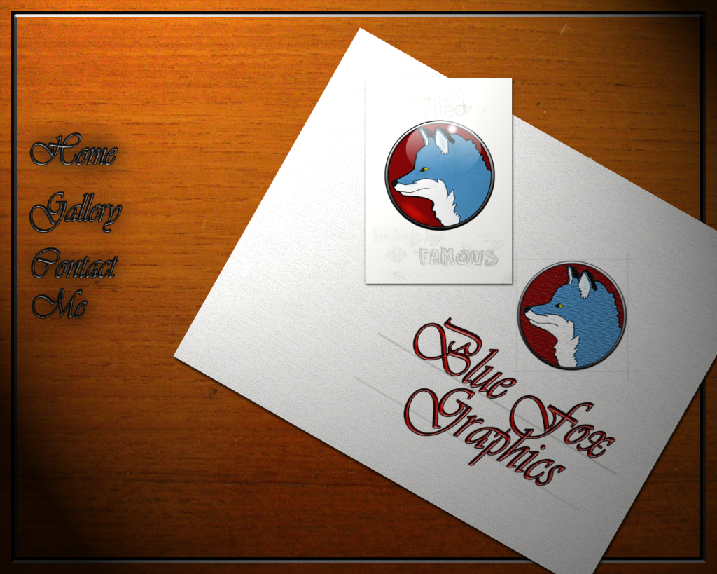


Since this is going to be my website for proffessional work, I figured I would see what your opinions where. this concept would be the main page. bear in mind it's still a work in progress...

Very good

I think the fox and look should be a bit edgier.....
It looks nice, but that wouldn't have me wanting to explore the site, I'd probably skip into another site fairly quickly.
I thoughts are a website has to be designed to keep people looking at it, telling friends about it etc etc.
No one likes awkward sites to navigate or sites which have too much going on in the page which slows navigation.
Make it edgy, make it simple. Winner
Obi-Wan: "If you spent as much time practicing your saber techniques as you did your wit, you'd rival Master Yoda as a swordsman"
Anakin: " I thought I already did"
Obi-Wan: "Only in your mind, my very young apprentice"

I really like the burned wood links....amazing!
Every time Tim ships an order... an angel gets its wings
"Just get one and go nuts, that's how this hobby works. Get stuff. Go nuts. Period." ~FenderBender~

I've been a freelance graphic designer and illustrator for over 10 years, designing logos, icons, and illustrations that are print ready for t-shirts, signs, vehicle wraps, web graphics, murals tattoos, etc.
It gives me the impression your strong suit is invitations and the wood gives me a rural folk art feel yet sci-fi/militant with the fox. The mix seems confused and indirect. If it was all wood bevel it would look more cohesive. The canvas texture filter on the fox doesn't line up with the box around it or follow the grain of the paper or the wood. The repetition of the fox seems out of place. If you want to repeat the logo, perhaps a watermark for one may be more effective. With a name like yours I would be inclined to go monochromatic blue, with maybe a second color (like your red, I'd personally go yellow or orange) for the links/borders in some variation. I'm also not a fan of the pencil "famous" and what ever is above it.
Sorry to be so critical just sharing some of my expertise since this is what I do best. By offering reason and suggesting solutions I'm trying to be constructive. If this is your first impression with client make it a good one!


I too do this for a living..
and it beig a personal site..you can sorta do what you wat as far as style..
however usabilty is still comethign you need to consider..
so far your navigation doesnt 'pop'.. the drop shadow is too 'blurry'..
and either white drop shadow..or maybe a white (light) stroke around the text will help makeit pop against the darker background.
designing for specific monitor resolutions can be trickey..
you will either exclude some people, or make it smaller for others...
so think about the 'frame' you are putting around your content to be delivered to the user as well..
think about natural focal points.. things of interest that can draw one's eye to a point of interest in the site.. ..etc
ok, I'll make changes. I think that perhaps the Abney Park music was influencing me there (They are a steampunk band). I just dont want to do something that's like everyone else's or ultra modern. I was trying for a more traditional look. As for my logo, I'm happy with it, it stays as is. At least until I get bored with it again probably. the words on the card were placeholders btw.
ther is nothing wrong with using the woodgrain or making the site 'look/feel' like a desktop or portfolio..etc..
organic images and textures can work just fine..if done correctly..
you could use a wood background..and your logo NO PROBLEMS... just a little 'lighting' working in Photoshop.. a better navigation layout... BAM!.. your in business! LOL
Thanks for the input. guys. I shall put it to good use. I'll post what I come up with soon. ^_^Originally Posted by xl97

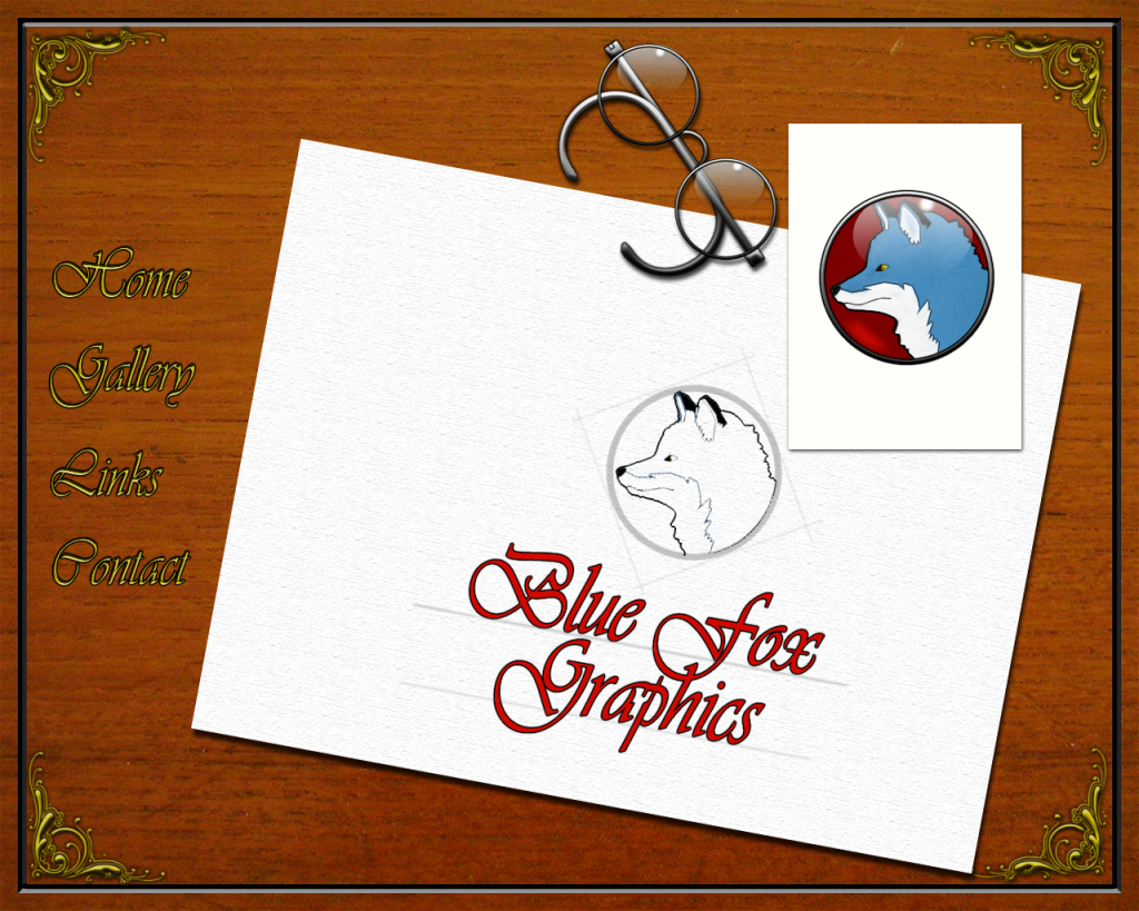
I thought about the suggestions and I really liked the old world theme. The burned wood links I changed to be more like gold inlay carving and I'm considering making them look like secret panels in the wood.
I'm also thinking about having each page being a sheet of paper underneath the main one. If I knew flash I would probably go with a victorian-looking book with the BFG logo inlaid on the cover. I could model a book in Lightwave easily and render it. The little card is probably going to go too. I had thought of placing a steampunk lightsaber in the middle of it as a gag for this thread though :P
 Posting Permissions


 Reply With Quote


Bookmarks