Page 2 of 2 FirstFirst 1 2
Results 11 to 18 of 18

Thread: WandererTJ's Ancient/Steampunk Lightsaber Hilt - 3D Modeling (Pic Heavy)

  1. #11

    Default

    I love how amature designers and MEs watermark the life out of all their images on GrabCAD. Copy Rights are for works of art images, literature, songs, etc. Design Patents are for designs of physical items. Utility patents are for utility or manufacturing innovations. Once a design is shown publicly...such as a forum here or grab cad without a patent application filing and pending confirmation...it is legally public domain. I deal with it daily and have been granted over 100 design patents and several dozen utility. Though many of my clients have finally realized the money spent on all the legal fees to write a solid patent is better spent developing the second generation while the competition play keep up. Recently had a former client loose a multi-million dollar patent suite because the infringing company had proof the VP of marketing showed an early concept sketch of the product during a Ted Talk event.

    Anyway nice looking design and modeling work. For rendering don't forget to turn perspective view on, it will make it look much more natural. The the orthographic non-vanishing point is a dead giveaway in a rendering, and a personal pet peeve. Failed several students for it when teaching solidworks/keyshot for an Industral Design program.
    Last edited by FenixFire; 05-26-2016 at 09:24 PM.

  2. #12

    Default

    Quote Originally Posted by FenixFire View Post
    I love how amature designers and MEs watermark the life out of all their images on GrabCAD. Copy Rights are for works of art images, literature, songs, etc. Design Patents are for designs of physical items. Utility patents are for utility or manufacturing innovations. Once a design is shown publicly...such as a forum here or grab cad without a patent application filing and pending confirmation...it is legally public domain. I deal with it daily and have been granted over 100 design patents and several dozen utility. Though many of my clients have finally realized the money spent on all the legal fees to write a solid patent is better spent developing the second generation while the competition play keep up. Recently had a former client loose a multi-million dollar patent suite because the infringing company had proof the VP of marketing showed an early concept sketch of the product during a Ted Talk event.

    Anyway nice looking design and modeling work. For rendering don't forget to turn perspective view on, it will make it look much more natural. The the orthographic non-vanishing point is a dead giveaway in a rendering, and a personal pet peeve. Failed several students for it when teaching solidworks/keyshot for an Industral Design program.
    Sorry to burst your bubble, but perspective was on for all of the renderings.
    I recognize the internet is the internet, so yes, I am going to watermark my images to death, because if it does get downloaded by click happy people, I want them to know where and who it came from. You want to steal design I made for fun and posted for free? Go ahead, but I want others to know that while I'm making certain works available for free, I also do not approve of selling those works for profit, whether it is the model or the renderings or 3D prints of the models at a cost higher than just the materials involved.
    As far as I'm concerned, this is a prop/replica forum, not some sort of "try to develop the science to make a functioning lightsaber" forum where patents would be necessary. I suppose the sound cards could be patented, but that's about it.

    Why include GrabCAD and SolidWorks on my watermarks? Well, for starters, I don't need every single person asking me what software I'm using to model with, so I'm not opposed to shoving it in their face. As for the GrabCAD logo, well, I use it as a sort of portfolio of my work, and any exposure/recognition/attention I can get right now is great, because I'm without a job since my last position was only temporary. So yeah, go ahead, bitch all you want, but do it somewhere else.

    Please refrain from derailing my thread any further.
    Last edited by WandererTJ; 05-27-2016 at 02:10 AM.

  3. #13

    Default

    Not bitching, actually offering a critique on how to improve the visual appeal of a portfolio piece. As someone who just hired 5 engineers in the last 6 weeks (2 ME and 3 Polymer) and multiple contract engineers over the last 15 years, as well as taught Profesional Portfolio Development courses for a BioMedical Engineering program. I think I might be qualified to do so. I tried to PM you but you do not have enough posts.

    Instead of the large watermark a simple signature and date looks more professional and more importantly makes you appear more secure. As for the perspective, what software? If GrabCads internal renderer that explains it. Because I traced over 2 of the images in sketchbook pro and the lines are parallel not converging. I suspect you used Photoview or Visualize, there are much better and easier to use free rendering software on the web. While mechanical aptitude, confidance and team player personalities are key, the graphic design and layout skills are becoming increasingly important even for MEs, as more and more MEs are presenting directly to client teams, or marketing teams if in a large Corp.

    When and if you want an actual portfolio review PM me.
    Last edited by FenixFire; 05-27-2016 at 06:03 AM.

  4. #14

    Default

    Remember in your first post....you asked for constructive criticism...he gave it and you went off the deep end telling him to "refrain from derailing my thread" ....realy?!?

    Quote Originally Posted by WandererTJ View Post
    I'd love to hear everyone's opinions on the design!
    I'm definitely open to hearing some constructive criticism!
    And i agree with the watermark....you have to remember not everyone see's the same....my brothers wife had a problem with heavy 3D games....would bother her eyes. You need to do one or the other with your watermark, layering them on top of each is to much. Do your signature or the typed script. Not to mech'in it makes it hard to read...for those of us it doesn't bother.

    With that said Its a real nice rendering...bit long. Making those greeblies on the choke will be a lot of fun....not impossible....just ...fun. Those among us that know how to do that pipe/tube bending can see how to make those greeblies you designed.
    I know the sabermaster himself (Rob Petkau aka Madcow) uses them, but there suppose to be crystals...crystals don't grow in marble shapes...(sorry ...inner pet-peeve)Also agree with darth_chasm...leather or wood on the grip. If built it would be a real nice looking saber....even with the marble in the crystal chamber.

  5. #15

    Default

    Quote Originally Posted by PhoenixHawk View Post

    PH; don't worry about it. The way the original poster starts his post with "First off" is very telling as to what his personality and demeanor toward criticism. Our HR personality profile software actually would red flag any essay response with that phrase.


    With that said Its a real nice rendering...bit long. Making those greeblies on the choke will be a lot of fun....not impossible....just ...fun. Those among us that know how to do that pipe/tube bending can see how to make those greeblies you designed.
    I know the sabermaster himself (Rob Petkau aka Madcow) uses them, but there suppose to be crystals...crystals don't grow in marble shapes...(sorry ...inner pet-peeve)Also agree with darth_chasm...leather or wood on the grip. If built it would be a real nice looking saber....even with the marble in the crystal chamber.
    Completely agree the saber is a nice design and said so. Though steam punk it is not and diesel punk it is a little closer on this one. Though overall it is too new and refined looking for either genre, but it does have a clean and concise aesthetic overall. I don't get a Old Republic feel from it, the leather wrap DC mentioned might help with that. It is a very mechanical and technical design, so it would be a perfect fit for a Jedi character who is also a skilled mechanic.

    I do generally agree with the mass produced marbles for crystals, though I do like using hand blown artisan marbles for Krayt Dragon Pears. The non-uniform surface texture, impurities in the glass, and if they know what they are doing color wisps can give a good internal energy look when lit. Those greeblies and the chamber as a whole would be a blast of a puzzle to realize and fabricate.
    Last edited by FenixFire; 05-31-2016 at 09:19 PM.

  6. #16

    Default

    Sorry for not responding earlier @fenixfire
    I meant to apologize before anyone else commented, but got caught up in other things.

    Anyways, I would definitely like to take a step back and apologize for being defensive. It was hard to tell where you were coming from in that first post, but by your second post I can definitely see that you are trying to help and I definitely appreciate that. For that, I must say thank you.
    Maybe I was having a bad day or I read your first post wrongly, but regardless, I should not have responded the way I did.

    I am using the Photoview that is build into my copy of SolidWorks.
    I think there might be a control setting for perspective scaling somewhere, but I've never used it before now.

    I know there are other options out there, I know many people use Keyshot, but so far any and all renderings I've done have mostly just been on personal projects. I did a few back in school while working on projects for my Design of Mechanical Components course in order to ensure my group's presentation looked as good as it could after a member of another team showed me what renderings were and how great they could look.

    Photoview certainly isn't the best thing in the world, nor are SolidWorks' native appearances, but I've made due so far.

    In the past I've had issues with Gold-Leaf Metallic Paint, and I'm currently having issues with the Krayt Dragon Pearl/Marble.

    I'm not sure if it's just the angles I did my renderings at, or if the varying thicknesses cause an illusion that it is not in perspective, but the renderings are in perspective.

    Also, in regards to the Steampunk/Dieselpunk remark, I went over it in this post: http://forums.thecustomsabershop.com...l=1#post259150


    Now, as for my watermark(s), I kinda get where you guys are coming from.

    I didn't look around for too many examples of what they should look like, or how big they should be, or any of that. None of my classes taught me about watermarks, but I do know I've come a long way from making a sketch on paper, scanning it, and applying it over an image, because you can clearly see it wasn't computer generated by the rough outlines... Yeah, it was bad.

    I mainly looked at these two pieces as reference of what I could do for my watermarks:
    http://sgthk.deviantart.com/art/Mast...heme-272380086
    https://grabcad.com/library/500g-eeva-supercar-1

    I really liked SgtHK's signature design, it was elegant but still managed to provide necessary information with overlayed text, which is what from what I'm reading, is what you guys don't like. Maybe I didn't execute it as well, or perhaps that style is better reserved for mesh-cloud (non-Solid) models.

    The second example, is where I got the idea for the footer. I believe there were also a few others with headers/footers, but this was the first that I found. I also know that a few people will put their signatures in as decals on the model itself, but I've wanted to avoid that. I know that just about any watermark will take attention away from what's in the image, but I wanted to avoid completely robbing the image of what its contents were.

    While I'm not sponsored by anyone other than myself, which means I don't really need a reason to add any logos on my watermarks, I know that Grabcad has in the past had issues with Chinese websites stealing the models and renderings and they've tried to sell them without permission of the modeler.
    They will take the model and not even bother to create their own renderings, so by adding the logo and my watermark, either they can use it and anyone that sees it will know where they came from, or they would have to make a new rendering, which takes time.
    If I'm creating things and uploading them for free, I want them to stay that way.

    The same thing goes with students in school. I know there are kids out there who are lazy and would sooner download something someone else made and try to take credit for it. So at least with watermarks on the renderings, they would have to spend their own time creating renderings if they chose to do so.

    Regardless of the intent, I do want people to know where and from who the models came from.
    If I help someone learn about how to model particular geometry in SolidWorks, awesome.
    If I am providing a model that is more accurate than anyone has produced thus far, awesome.
    If the models/renderings help me achieve getting my next position, again that's awesome.

    The SolidWorks watermark/logo is pretty self explanatory, it's so others know what software I use.

    I add the Creative Commons free licensing to my renderings and each of my models because I know that there have also been those who were taking models from websites and selling 3D Prints of them.
    While that's in a bit of a grey area, I don't want that happening with my models. If you are charging someone for 3D Prints of my models, it should purely be the cost of the materials without any markup.

    But mostly, I just don't want people taking my models or renderings and uploading them on other websites without my permission.

    The footer is pretty easy to crop out, which is why I've added the signature watermark, and I usually place it over a gradient background (I didn't for these), and I try to slightly overlap it onto the model. That way, if someone wants to try and edit it out, it'll at least take them longer than most want to put effort into.


    @PhoenixHawk, I knew from the very beginning that I wanted to use a Krayt Dragon Pearl in the design of my lightsaber. It's what I had used in KOTOR, so it just made sense to me to try and use it here.
    In the game it appears as a sphere, and the only other representation of it is by Rob Petkau aka Madcow, and in that representation, it again appears as a sphere.
    So if it's a thing in books somewhere that it gets cut into a crystal shape, that would be news to me.
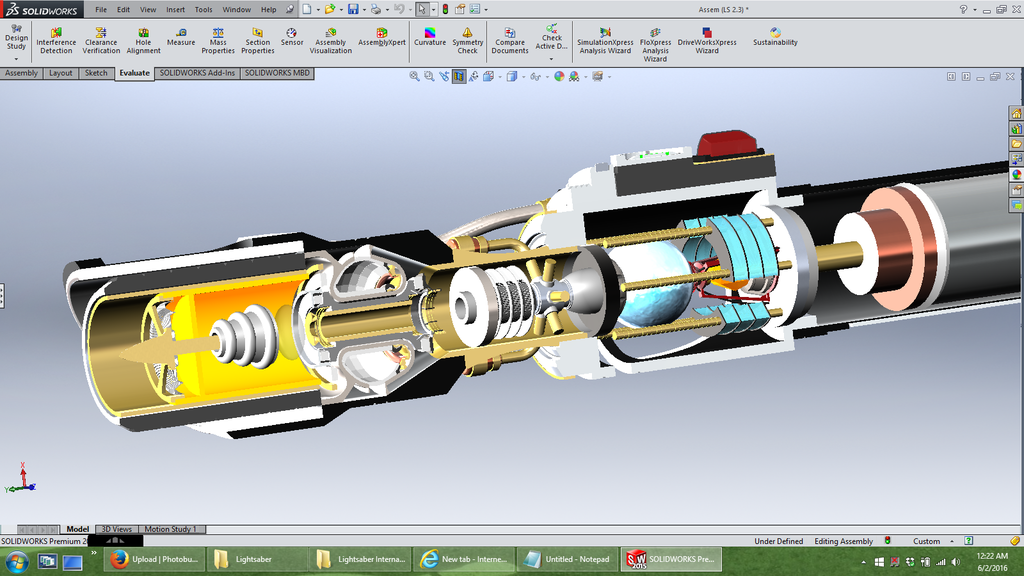
    While it isn't crystal shaped, I do have an actual crystal in the core, be sure to look at the rendering of the core I have on the first page again! (EDIT - Added a photo of it)

    http://brainwagon.org/wp-content/upl...op-300x300.png
    While refraction through a sphere may not be the most ideal, it isn't the worst thing in the world.
    On the upside, by adding elements from DPSS lasers, hopefully any negative effects caused by this would be otherwise fixed.
    Then again, I'm building off of the Scifi science already presented, and my internals are mostly meant to just look cool.

    That said, while it's all still a work in progress, hopefully you all will enjoy this:


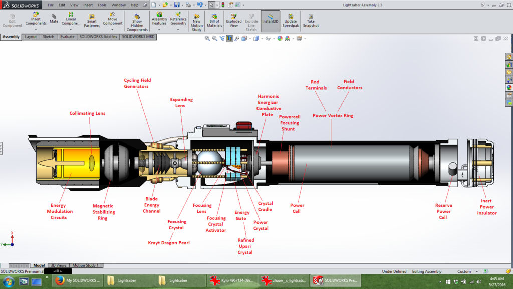
    And here's an older shot. Before you guys say anything, YES, SOME OF THE ARROWS POINT TO THINGS THAT ARE NOT IN PLACE YET
    Please also note that many of the internals are placeholders of what is yet to come.


    Here's a shot of the Power Crystal sitting in its redesigned crystal cradle!

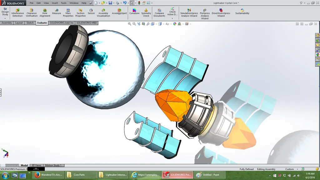
    I'm actually not a fan of how the rippled water effect looks like after it is rendered, but pre-rendering it looks great on the Krayt Dragon Pearl!
    Last edited by WandererTJ; 06-01-2016 at 11:29 PM.

  7. #17

    Default

    JT,

    Thank you for manning up with the apology, but non was expected or needed. Your response was actually quite common, and anticipated. It is hard to take criticism, that's the #1 reason for students leaving the Industrial Design or any fine arts program. I also tend to come off harsh with my first round of critique as a method to break through the defenses faster.

    Metallic films/paints like what would be needed for gold leaf and glass/translucent/gem materials are really the test for the quality of a rendering package. That is actually where keyshot and Maxwell excel. Keyshot is by far my go to, but at 2500 a year I know it is a professional software. Photoview can do good renderings. If I get a chance over the next couple of days I will play with it and see what settings might need to be adjusted since it has been several years since I actually installed it with SWX. I do remember there was 2 ways to zoom one held the perspective and just increased the image size. The other adjusted the focal length of the camera distorting the perspective...in some cases even giving a fish-eye lens look.

    Personally the EEVA signature is more Professional in appearance than the SKG, and don't worry yourself with the Chinese. They will steal anything they want, there is no IP protection in that country so anything you do is not protected anyway. I have had factories take designs that they were manufacturing under signed NDA and not only show the competitors but provide them with production samples with my clients logo removed and the competitors logo in its place. In the most blatant instance we had a factory prototype a series of 4 gas grill designs for one of our clients. they choose 3 of the designs to take into production. The 4th design showed up at Home Depot about a month after our clients 3 models...branded as the competitor. The time you spend worrying about protecting your concepts is time better spent ideating, designing, and refining. I was once given this advice and it is true " Imitation is the highest form of flattery."
    Last edited by FenixFire; 06-02-2016 at 07:08 AM. Reason: Spelling...that's why I draw to communicate.

  8. #18

    Default

    Perspective setting changes.

    Option 1: Global effect when ever perspective is turned on. For the settings 3 is the default and very close to Iso, 2 is what I generally use as with medical hand pieces there are a lot of generally cylindrical based forms, 4 is pure ISO, and anything 5 or higher gives a fish eye appearance.

    To change:
    View -> Modify -> Perspective: Change to 2 (or 1 if you want a dramatic foreshortening look)

    Option 2: Set up dedicated cameras.

    When setting up the cameras use 50mm standard. Generally this is the lens that most closely mimics what the human eye sees. That is why a fixed zoom 50mm macro lens was required for us old timer Industrial Designers who actually had to take photography classes to learn to use film cameras for taking slide images for our portfolios.

    Also, if you want to check out some great and yes some not so great portfolio examples check out Core77.com and Coroflot.com. It is a design and product development community similar to this one. Though it is heavily focused on designers there are a large number of engineers who frequent the boards and portfolio pages as well. You can post portfolios and resumes as well. It is a far better place to post and link to in a resume or email than GrabCad.
    Last edited by FenixFire; 06-02-2016 at 07:17 AM.

Bookmarks

Posting Permissions

  • You may not post new threads
  • You may not post replies
  • You may not post attachments
  • You may not edit your posts
  •